
The Secret Language of Colors: A Crash Course for Creatives Who Think They Already Know Everything
- Mrinal Yadav
- Jul 4, 2025
- 4 min read

So, you've been mixing colors since you were three and discovered that yellow + blue = a very muddy green that your parents definitely didn't want on the kitchen wall. But here's the thing about color theory, it's not just about knowing which colors "go together." It's about understanding why certain combinations make you feel like you could conquer the world, while others make you want to hide under your weighted blanket. Here's our color theory for designers who think they already know everything!
The Psychology Behind Your Favorite Palette
Colors aren't just pretty, they're psychological manipulators in the best possible way. That deep forest green you're obsessed with? It's literally lowering your cortisol levels. The reason you can't stop staring at that sunset-orange notebook is because warm colors trigger the same neural pathways as actual warmth and comfort food.
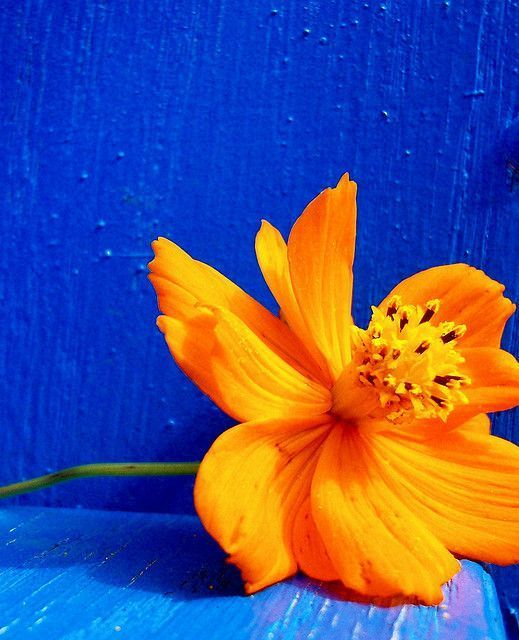
Here's where it gets interesting: Color temperature isn't just about warm vs. cool. There's something called "advancing" and "receding" colors. Warm colors (reds, oranges, yellows) literally seem to move toward you, while cool colors (blues, greens, purples) appear to step back. This is why your tiny apartment feels bigger when you paint it in cool tones, and why that red accent wall makes your room feel cozy but cramped.
Use advancing colors for elements you want people to notice first, and receding colors for backgrounds. Your Instagram feed will thank you.
The Dirty Little Secret of Complementary Colors
Everyone knows about complementary colors. They're opposites on the color wheel, they "pop" together, blah blah blah. But here's what design school won't tell you: pure complementary pairs are actually kind of aggressive. That electric blue and screaming orange? It's giving "gas station sign," not "sophisticated design student."
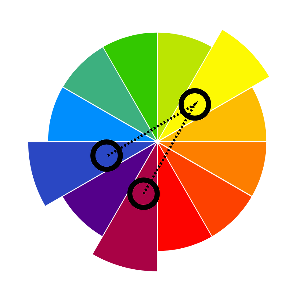
The real magic happens with split-complementary schemes. Instead of using the direct opposite, grab the two colors on either side of the complement. So if your main color is blue, skip the orange and grab yellow-orange and red-orange instead. Suddenly you've got harmony with tension (like the perfect friend group where everyone's different but somehow it just works).
Even better: Try analogous schemes with a complementary accent. Pick three colors that are best friends on the color wheel (like blue, blue-green, and green), then add just a tiny whisper of the complement (red-orange) as an accent. It's like adding the perfect amount of chili to chocolate, unexpected but absolutely right.
Saturation: The Unsung Hero of Sophisticated Palettes
Here's where most people mess up: they think "bold" means "saturated to the max." But the most sophisticated color palettes? They're playing with saturation levels like a DJ mixing tracks.

Highly saturated colors are extroverts. They demand attention, they're confident, they're that friend who always knows the best parties. Desaturated colors are introverts. They're subtle, sophisticated, they make you lean in to really see them.
Best practice is to mix the two. Use one or two saturated colors as your stars, then support them with desaturated versions of the same hues.
The Magic of Undertones
Something to keep in mind while using colors is that every color has an undertone, a subtle hint of another color lurking underneath. That "neutral" beige might have pink undertones that make it feel warm and cozy, or green undertones that make it feel fresh but slightly clinical.
Here's the game-changer! When you're building a palette, match your undertones, not just your main colors. A warm white (with yellow or pink undertones) will make your cool blues look muddy and confused. But pair that same blue with a cool white (with blue or gray undertones), and suddenly everything feels intentional and harmonious.
Quick test: Hold your colors up against different whites. The "right" white will make your colors sing; the wrong one will make them look like they're having an awkward conversation at a party where they don't know anyone.
The 60-30-10 Rule (But Make It Personal)
The classic interior design rule says use 60% of a dominant color, 30% of a secondary color, and 10% of an accent color. But this isn't just for room design, it works for everything from your outfit to your sketchbook spread to your entire creative project.
But your "dominant" color doesn't have to be the most eye-catching. Sometimes the most sophisticated designs use a neutral as the dominant color, letting the bold colors do their thing in smaller doses.
Your Color Personality Test
Want to know your color personality? Look at your last five creative projects. Are you a monochromatic minimalist (variations of one color)? An analogous harmonizer (colors that are neighbors on the wheel)? Or a complementary rebel (you love the tension of opposites)?
There's no wrong answer, but knowing your default can help you stretch. If you're always reaching for analogous schemes, challenge yourself with a split-complementary. If you're a complementary colors person, try the subtle sophistication of a monochromatic palette.
And yes, Color Theory is Just the Beginning
Color theory isn't a rulebook, it's a language. And like any language, once you understand the grammar, you can start breaking it intentionally. The best creative work happens when you know the rules well enough to bend them with purpose.
So grab a notebook (we happen to know where you can find some good ones), start playing with color combinations that make you feel something. Because at the end of the day, the best color palette isn't the one that follows all the rules—it's the one that makes you want to create more.
Time to get your hands dirty with some actual color mixing. Your screen can show you the theory, but your creativity lives in the messy, beautiful world of paper and pigment.


Comments